PEYA – Flavored Coffee Syrup
Service : Logo Design | Packaging | Illustration | Print Media
Sector : FMCG
Peya name works on the philosophy that “when the right syrup added to the right coffee-based drink can take your coffee drinking experience to a whole new level”.
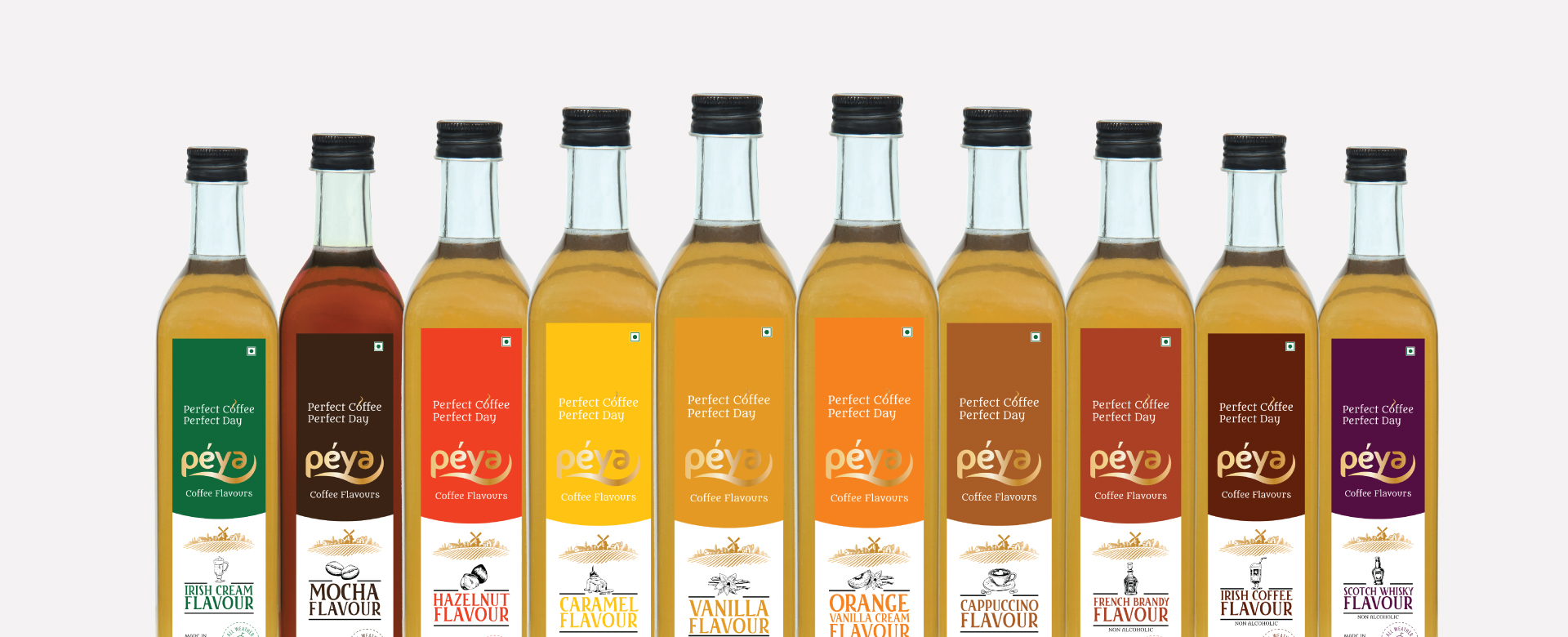
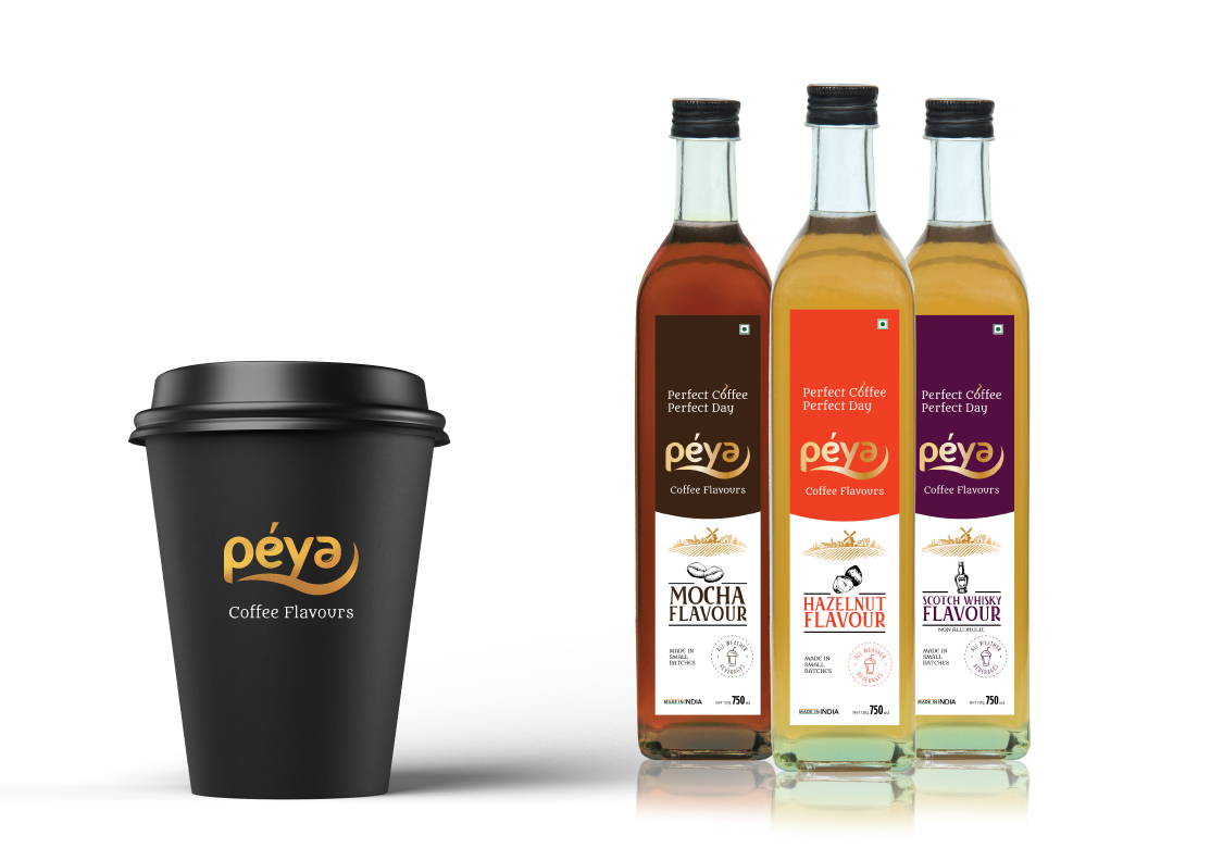
GREYPHYTE revamp the entire packaging design along with Logo designing considering the International standards.
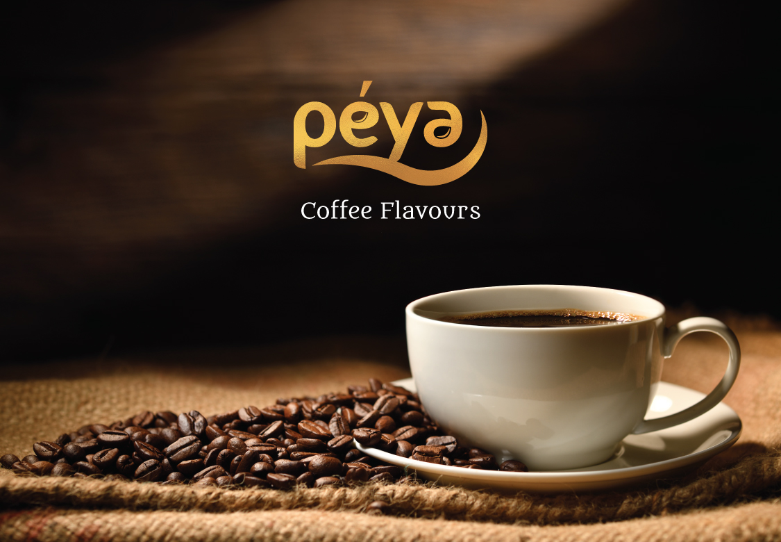
We strategically place the coffee beans element in Logo simplifying the identification of the Brand Name and use the coffee based golden color along with wave to depict the flow of liquid syrup.
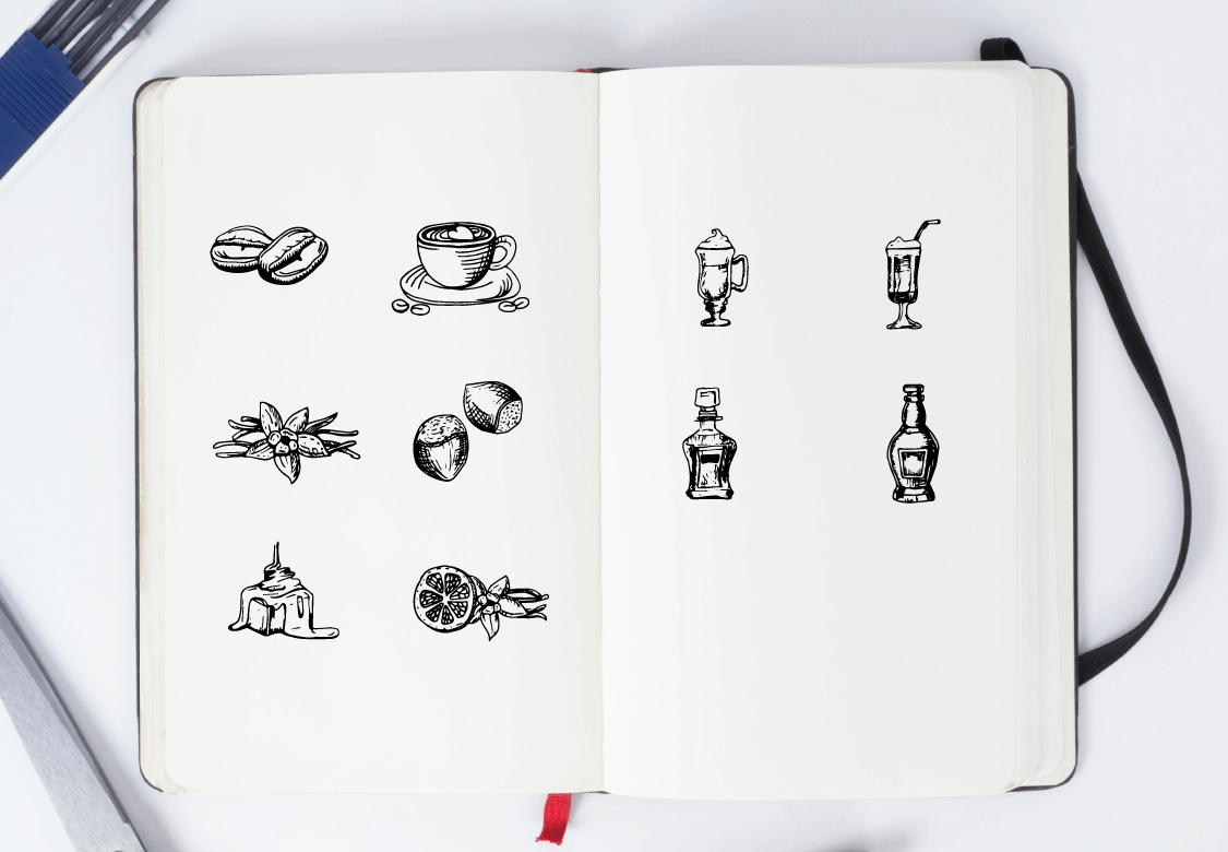
USP of this project is a hand drawn illustrations with identical color which were designed to create flavour differentiation for their product range
